À table
À table is a cooking app that uses Material design components to create an easy to explore experience.
The app allows the users to find recipes elaborated by talented chefs.
Through the design the app aims to be modern and clean.
1. Product architecture
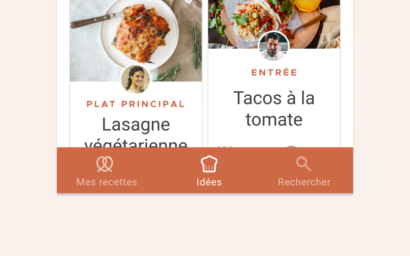
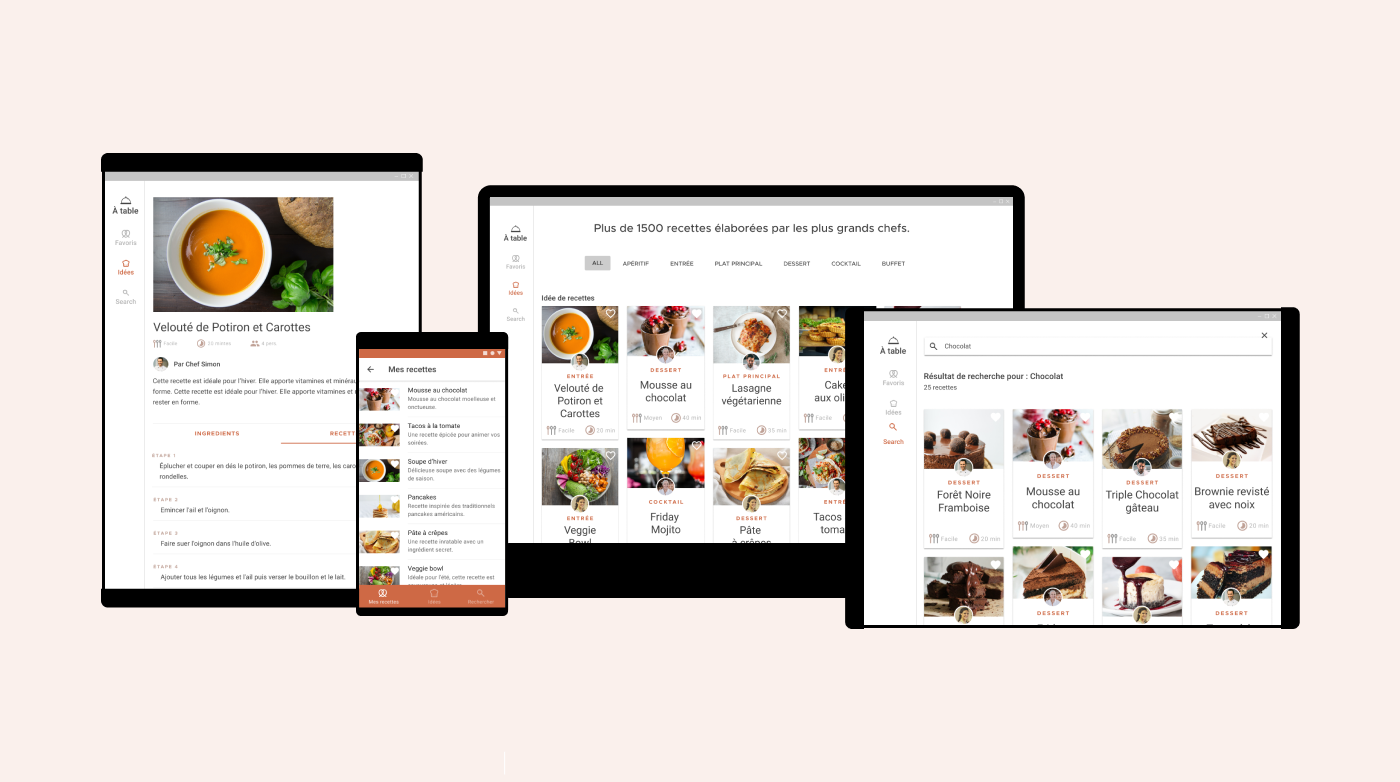
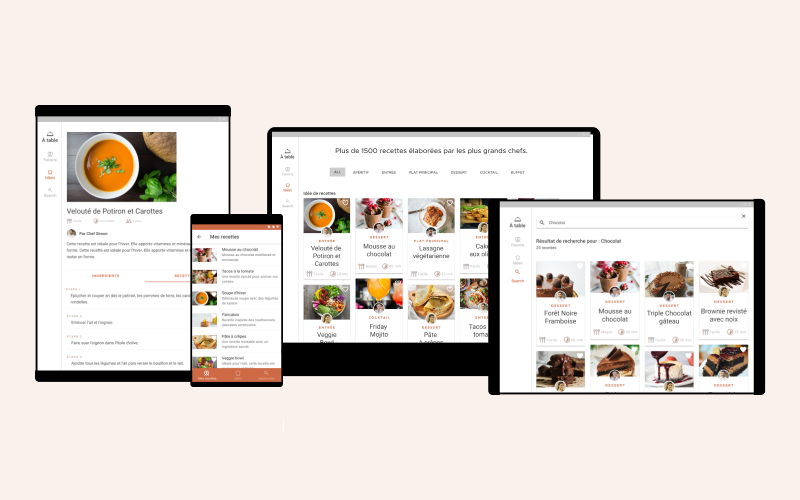
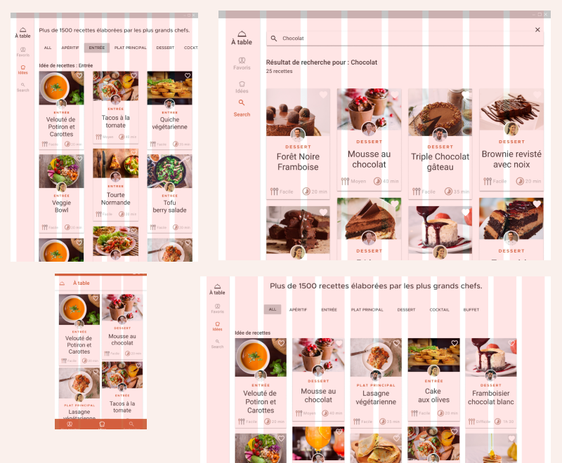
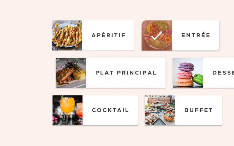
The mobile app opens on the “ideas” pages, where new recipes are featured. A bottom navigation allows the user to navigate between his saved recipe and search a recipe. On the search part he can access the 6 main sections of the app “Apéritif, Entrée, Dessert…”. On desktop and tablet the main sections are directly accessible from the home page with the use of chips.
2. Layout
Grid system
À table uses a responsive grid system, with flexible columns and padding that can resize depending on the screen width.
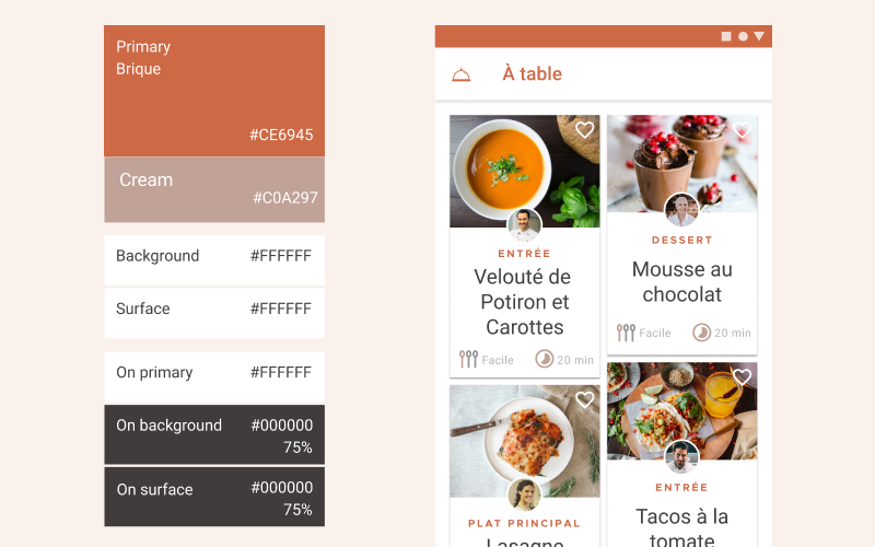
3. Colors
The app design aims to be minimal to keep the focus on the recipe content. The primary color is a muted orange. The same primary color is used to highlight important elements like categories. Icons are in a light variant of the primary color.
4. Typography
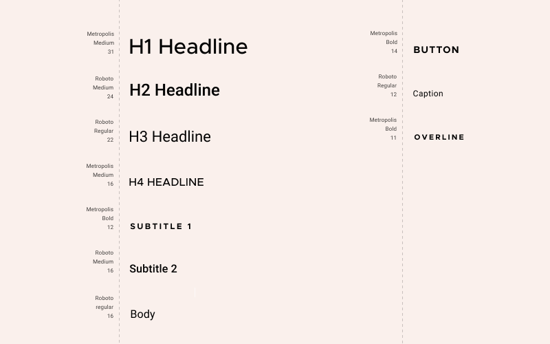
Typefaces and Typescale
Robot and Metropolis are used across the app. Metropolis is used for uppercase elements like overlines and subtitles.
5. Iconography
All icons were created using the same underlying grid structure in order to create consistency. Stroke terminal is rounded, stroke width is 2dp and icons are unfilled.
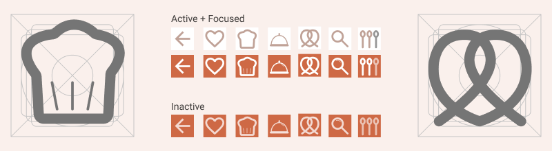
6. Components
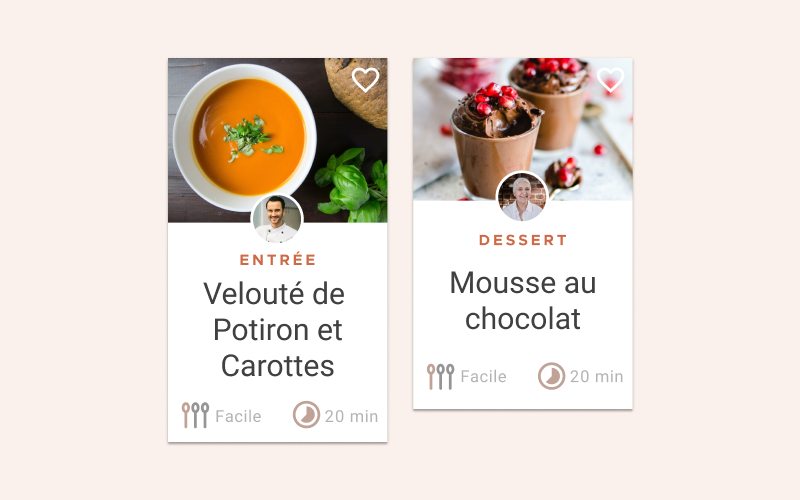
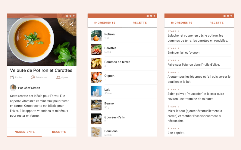
Cards
Recipes are presented using a card collection. They have custom shape, color, typography, and iconography, with center-aligned content. The recipes collection uses a masonry pattern (where cards have varying heights).
Chips
On the mobile app, the user can use chips to visit the sections.
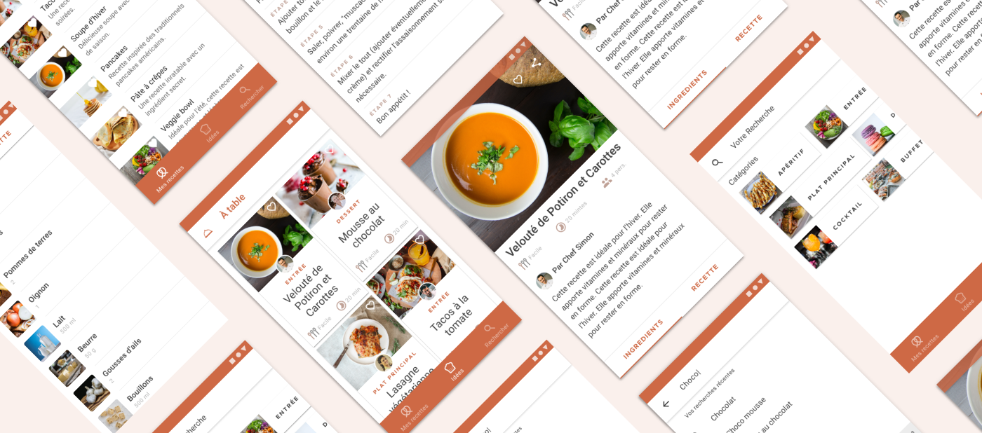
List
A variety of list components are used to display ingredients, recipe steps, favorite recipes and search results.
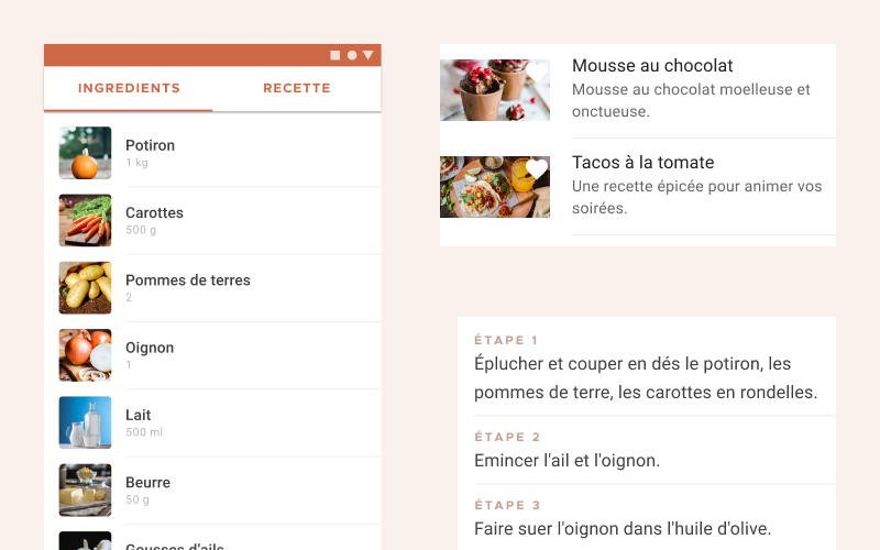
Tabs
On mobile, tablet and desktop, user can toggle between ingedients and directions using tabs. Tabs are display on the bottom of the recipe screen, when selected they move up, to the top of the screen.
Bottom navigation
À table bottom navigation component has custom color and iconography.