Redesigning company profiles to give job seekers crucial insights and increase conversion rate
Introduction
About the company
Welcome to jobs.ch, Switzerland's go-to online job portal! Every day, job seekers come to us to browse through thousands of new job ads. In today's competitive job market, it's crucial for us to offer up-to-date and insightful information that helps people find their dream jobs and perfect companies without ever leaving our platform.
Problem statement: outdated company profiles penalize job applications
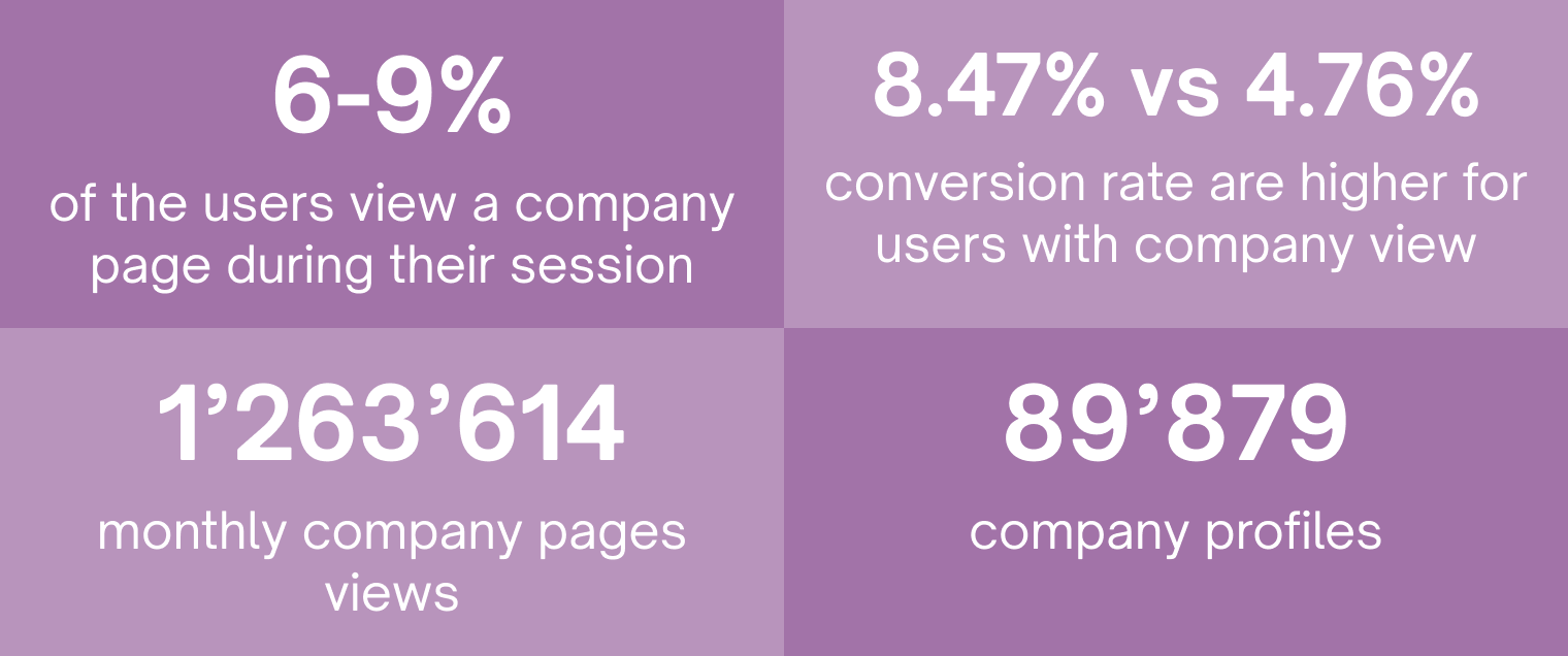
We know that when job seekers look at a company profile, they're about 10% more likely to apply for a job. To make the most of this, we want to make sure that every job seeker has all the info they need right at their fingertips. No more jumping from site to site just to determine if a company is the right fit.
However, our company profiles haven't been updated in a while. Are these pages providing job seekers with the relevant information they need? Our goal is to redesign these profiles to be more engaging, informative, and helpful, keeping job seekers on our site longer and helping them make informed decisions.
Solution
Outdated company profiles were failing to engage job seekers and led to fewer applications. I redesigned the experience with clearer ratings, a media gallery, and structured job listings to build trust and transparency. Six months after launch, time spent on profiles doubled and applications from profile pages increased by +5%, surpassing our initial goal.
Goals and success metrics: increasing engagement and applications
Our main goal is to provide job seekers with all the essential insights they need about their potential future companies. We want to engage them right on the company profile pages so that they’re inspired to hit that “apply” button. Additionally, we aim to simplify and inform the decision-making process.
To measure success, we’re targeting a 3% increase in job applications from our company profile pages. It’s all about making these profiles not just informative but irresistibly engaging so that job seekers feel confident and ready to take the next step in their career journey.
Roles and responsibilities
-
As a UX designer in a scrum team (1 PM, 3 backends and 4 frontends):
- I collaborated with teams to understand project goals on B2C and B2B side, user needs, and technical constraints.
- I designed surveys to gather insights about user needs, behaviours, and pain points.
- I developed wireframes to visualise the structure and layout of pages and communicate design ideas to stakeholders.
- I planned and conducted usability testing sessions to gather feedback.
- I developped new components concepts and guidelines for the design system.
- I delivered high-fidelity prototypes detailed enough for developers to understand and implement accurately.
Research: understanding job seekers' needs
To better understand what job seekers really need, with the help of the research team, I conducted a survey with 100 participants from the German and French-speaking regions of Switzerland. I wanted to find out what information they consider crucial when deciding to apply for a job.
Key findings: what job seekers want in company profiles
- Benefits matter: Job seekers are very interested in employee benefits and want detailed information.
- Company culture & values: Understanding the company's culture and values is a top priority for job seekers. They want to ensure they’ll fit in and thrive.
- Work environment photos: Visuals of the work environment help job seekers visualize themselves in that setting..
- Company ratings: About 80% of job seekers check company reviews from current and former employees before applying. Ratings and reviews play a big role in their decision-making.
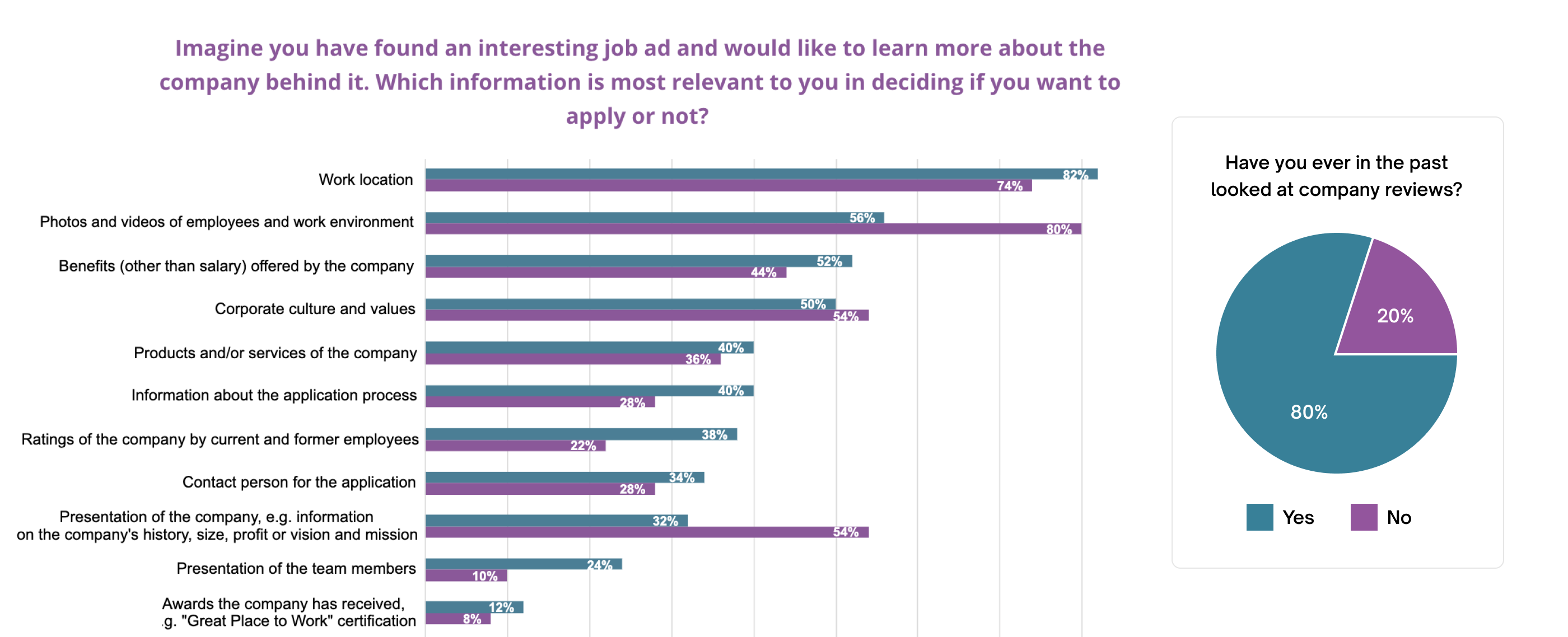
The survey revealed that 80% of job seekers looked at reviews before applying to a job.
Current platform capabilities and gaps: identifying areas for improvement
At the moment, our platform doesn’t provide detailed descriptions of employee benefits, which is something job seekers are interested in. While we do have a company overview and some photos and videos of the team and workspace, they’re buried at the bottom of the page and are hard to find. They could be more prominently featured to help job seekers make informed decisions.
| Wanted feature | Currently available on jobs.ch? | Notes |
|---|---|---|
| Presentation of the company (history/size/vision/mission…) | ✅ | But dependency with B2B to improve it |
| Photos and videos of employees and work environment | ❗ | Not visible - At the bottom of the page |
| Ratings | ❗ | To be improved |
| Benefits | ❌ | Not displayed but available B2B side |
Design solutions for key challenges
Key challenges:
1. How can we quickly give job seekers a sense of what it would be like to work at the company using photos and videos, while making the overall page more engaging and visually appealing?
2. How can we improve the display of overall ratings and show other relevant information that job seekers need to assess a company?
3. Companies post an average of 8 to 40 job ads, making it hard for job seekers to find relevant positions. Data showed that users weren't using the filter option.
1. Engaging job seekers with photos and videos first to showcase workplace atmosphere
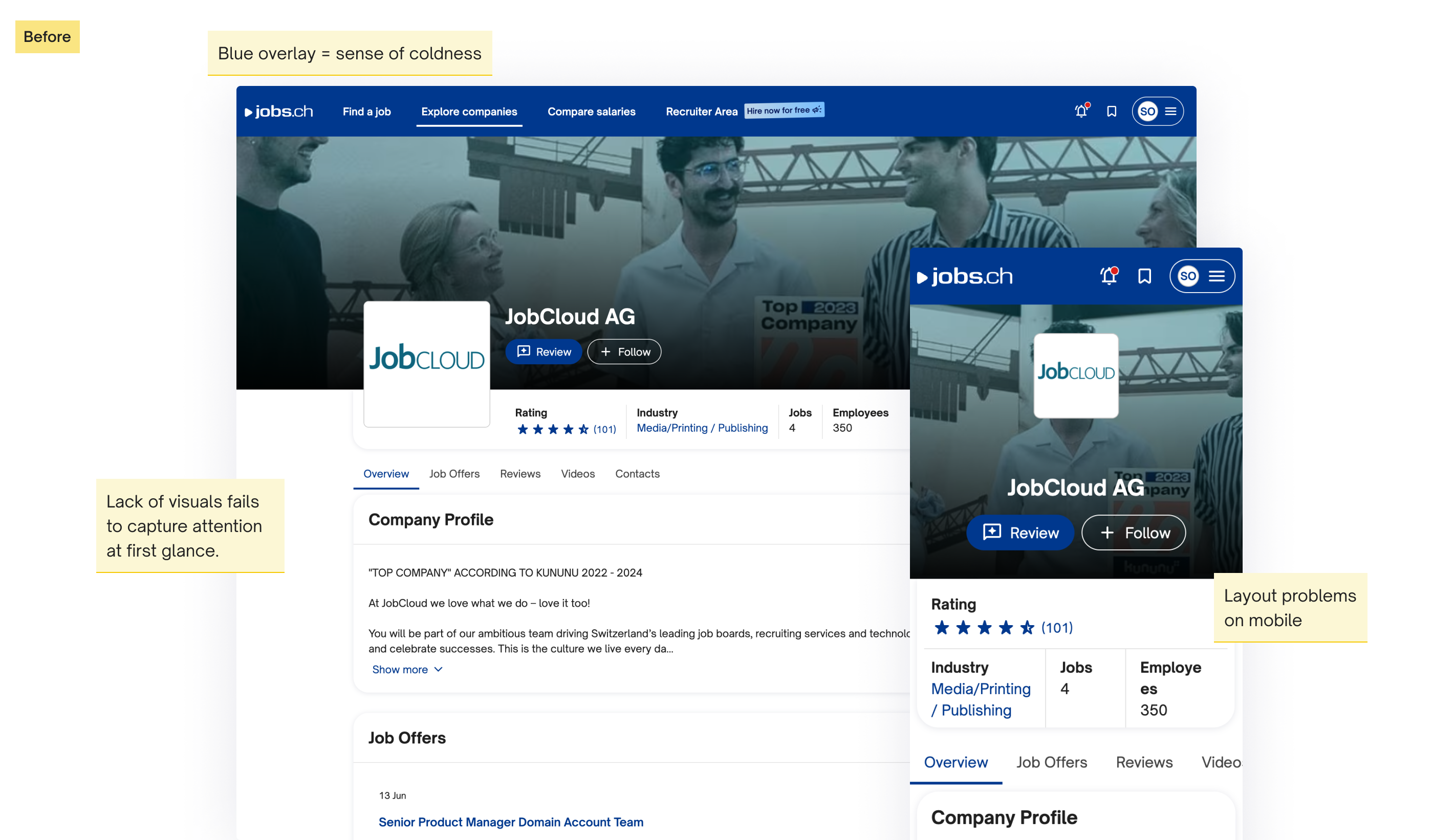
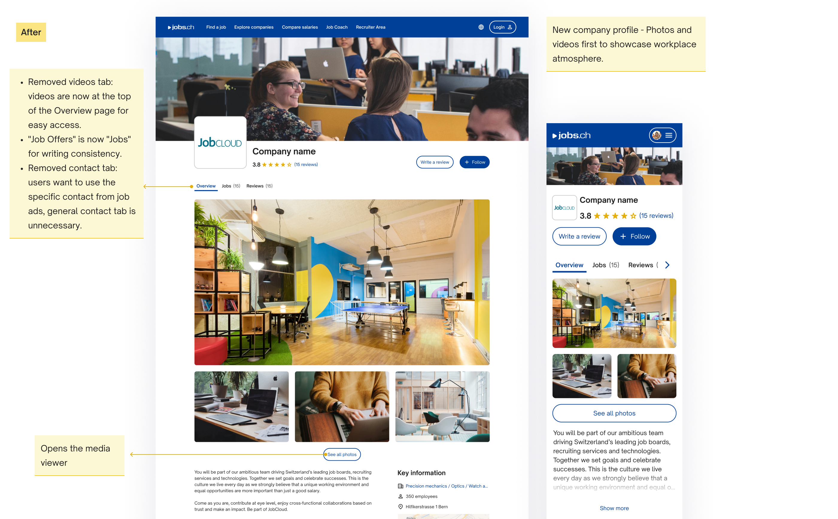
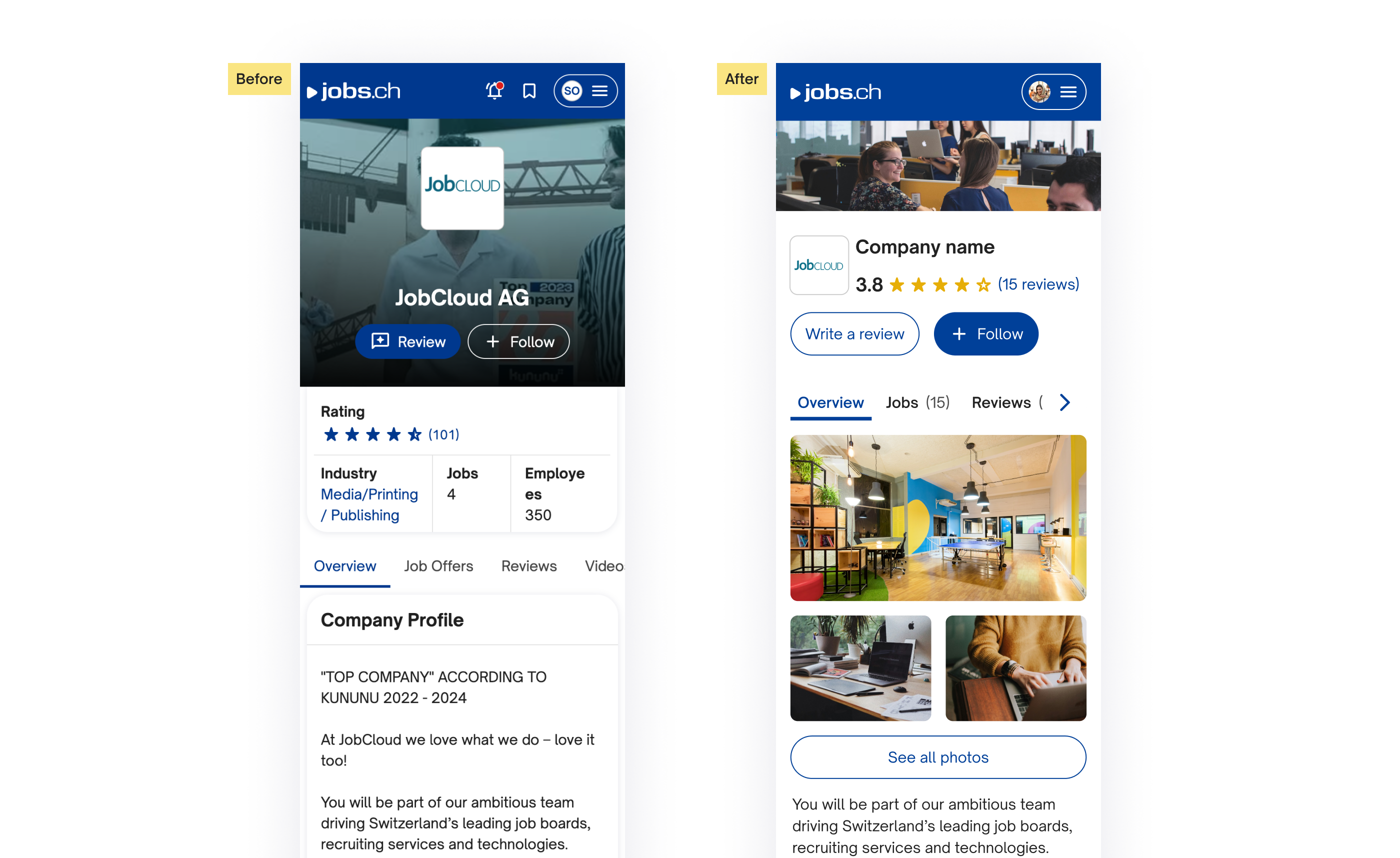
To catch user attention and give a taste of what it would be like to work there, photos and videos are displayed as a media gallery at the top of the page. To control the length, there is a button to see all media, which opens the media viewer.
Navigation updates:
- Removed videos tab: Videos are now at the top of the Overview page.
- "Job Offers" is now "Jobs": For consistency.
- Removed contact tab: Job-specific contacts made the general contact tab unnecessary.
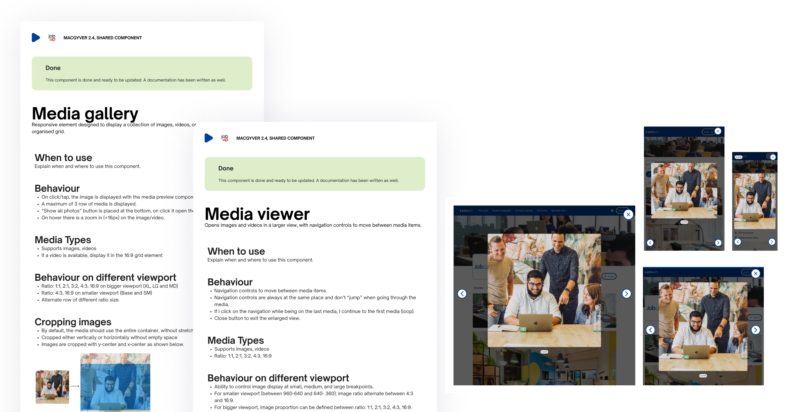
New design components for the design system:
Media gallery and viewer: These are documented with guidelines, behavior, best practices, and accessibility rules, including alt text for images and keyboard navigation.
These changes created a more engaging and user-friendly experience for job seekers, allowing them to visualise their potential work environment and navigate the site more efficiently.
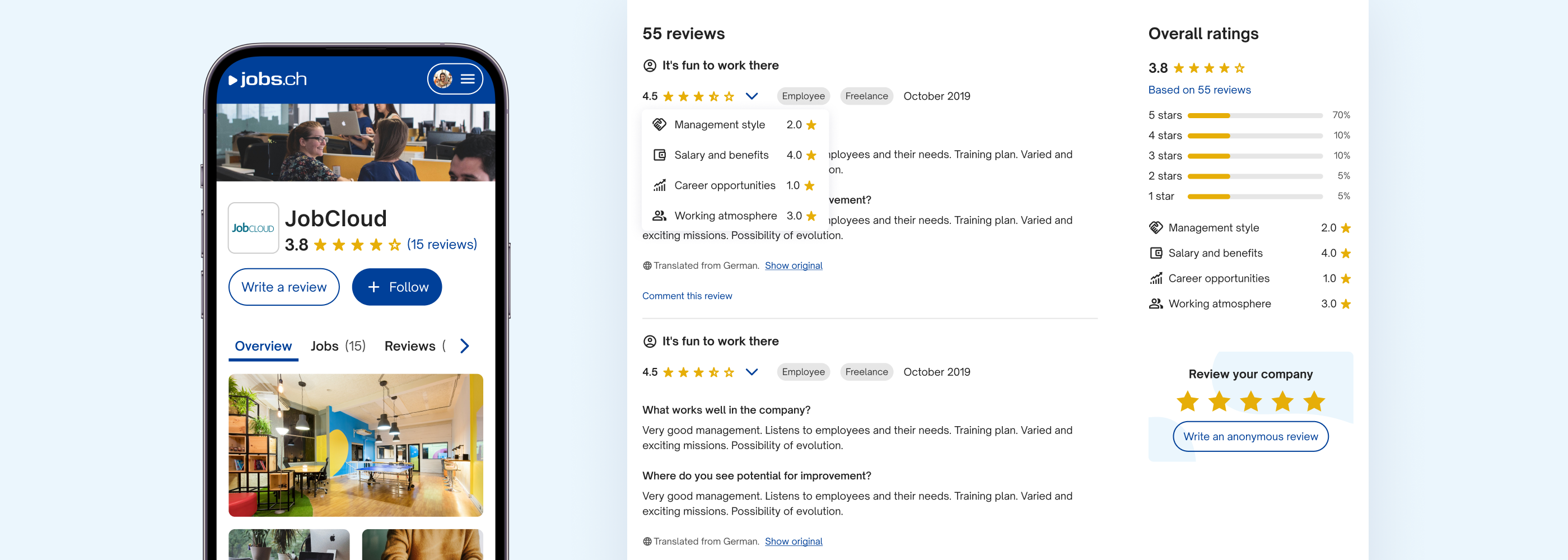
2. Improving company ratings to help job seekers evaluate employers
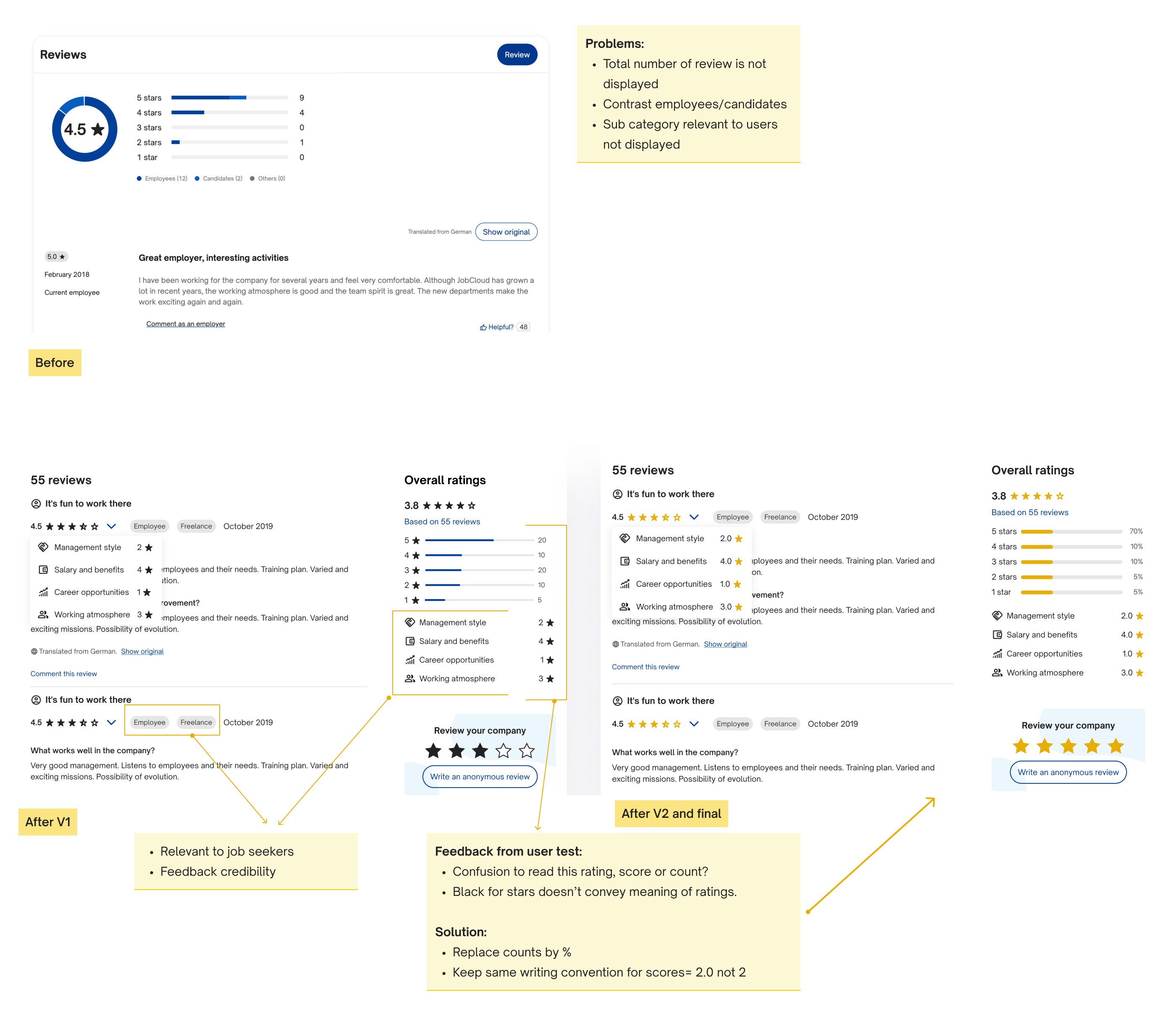
I improved the existing design, but there were still challenges in finalizing the solution. User testing was crucial in identifying and addressing these issues. Through iterative feedback and testing, I refined the design.
The challenge with the new design was that users were confused by the difference between rating scores (e.g., 3.2 stars) and the number of ratings.
Solution:
- Percentages for counts: I switched from raw numbers to percentages to make the rating counts clearer. For instance, instead of "150 ratings," users now see "8% positive ratings."
- Decimal format: For greater clarity, I standardised ratings to a decimal format, like "2.0" instead of just "2".
3. Improving job ad usability for listings of all sizes
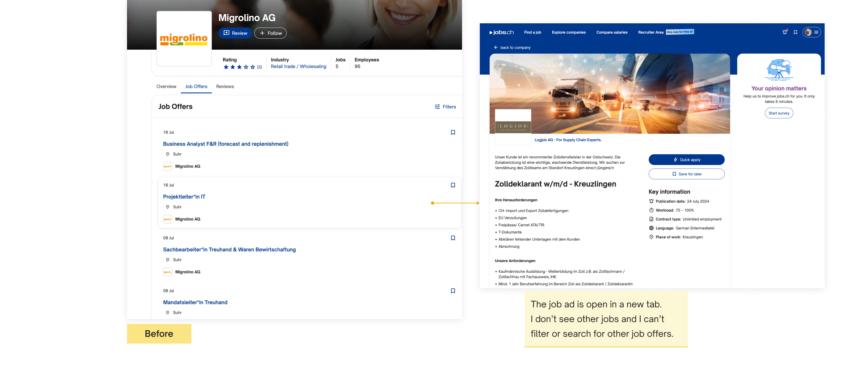
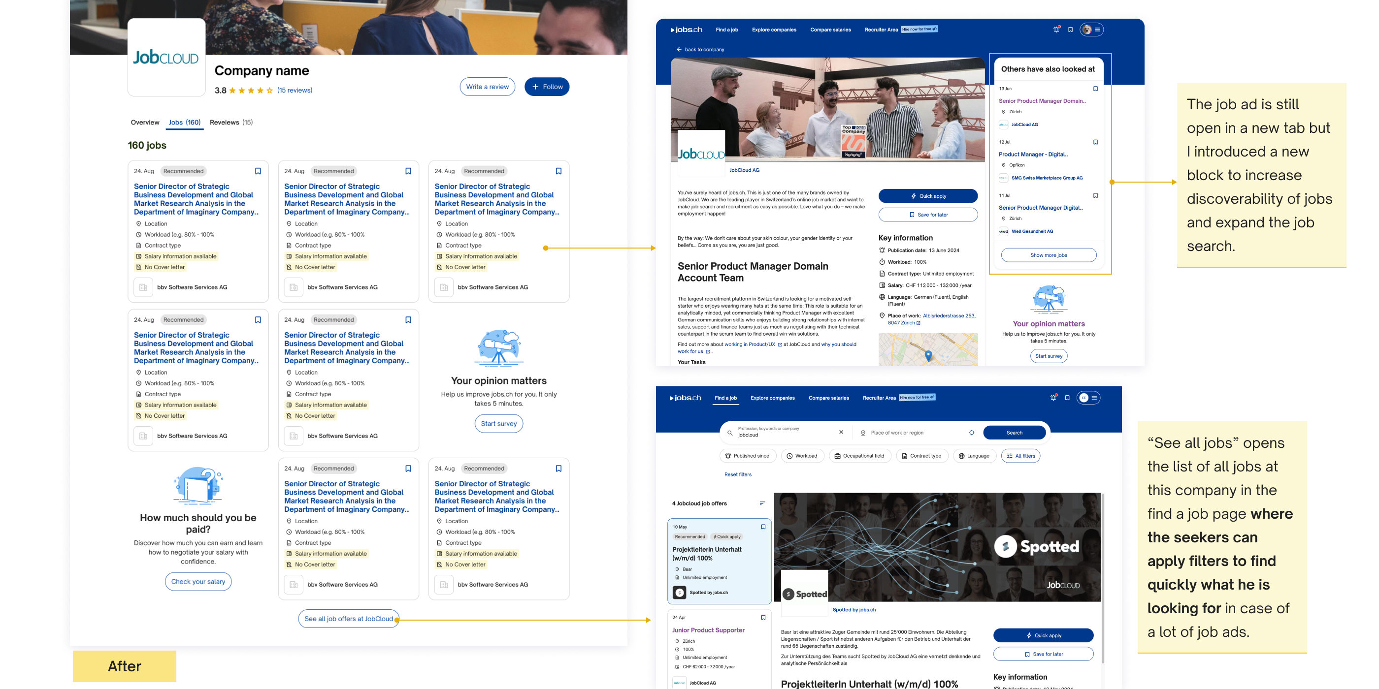
On average, a company has 8 job ads. Nevertheless, we have paying clients that can have up to 40 job ads. How do job seekers find the job that fits them in the current solution? Do they use the filter button? Data shows that they don’t. Because it’s not used, we decided to remove this filter option and find another solution to help job seekers see clearly in case of multiple job ads.
Solution:
- Redesigned job listings: Instead of a simple list, I introduced job cards with additional details like salary and contract type for better clarity.
- Improved navigation: To manage long lists, I implemented a layout showing 3 rows of job ads followed by a "See All Jobs at CompanyName" button. This button redirects users to a dedicated job search page where they can view the full list, apply filters, and search by job title.
This approach helps job seekers quickly find relevant positions while maintaining a clean and user-friendly interface.